User Interface Tutorial
This tutorial covers the controls in the Java applet that are independent
of the specific model chosen. These areas are the pulldown
menu at the top, the plotting controls
in the lower left, and the plot itself on the right
side.

Pulldown Menu
The pulldown menu at the top of the applet allows the user to choose which
model to use. The first thing to do when you
load the applet is to check to see that the correct model is selected.
Currently, there are 5 available choices:
-
Instantaneous Pulse Input in an Infinite Domain
-
Continuous Input in a Semi-Infinite Domain - First Type Boundary Condition
-
Finite Duration Input in a Semi-Infinite Domain - First Type Boundary Condition
-
Continuous Input in a Semi-Infinite Domain - Third Type Boundary Condition
-
Continuous Input in a Semi-Infinite Domain - Third Type Boundary Condition
with Decay
The relevant equations and controls specific to these models are covered
separately in the tutorials written by Professor Valocchi.
Plotting Controls
Solution Type
The first two controls allow the user to choose between plotting a curve
at a specific time or at a specific distance and to specify the time or
distance. Since these controls determine the procedure used to create
the curve, the choice that is selected when the user
pressed the Compute button determines which
curve will be shown.

The "Number of points to compute" box allows the user to specify the
number of data points that are computed when the Compute
button is pressed. More points will make a smoother curve but may
take longer to compute. More points will also increase the precision
with which a user can interrogate the curve in the plot area. 150
points seems to make a reasonably smooth curve for most choices of parameters.
Scaling
This area controls the scaling of the horizontal axis in the plot.
Automatic and Manual scaling are available.
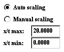
Automatic Scaling lets the program choose the horizontal extent.
In Automatic Scaling, the horizontal axis always starts with 0. When
this is selected, the "x or t max:" and "x or t min:" text boxes are not active.
In some browsers these boxes are grayed out and it is obvious that they
are inactive, but other browsers do not follow that convention when rendering
the applet.
Manual Scaling activates the "x or t max:" and "x or t min:" text boxes.
These values are then used for the horizontal range when the plot is computed.
Switching between scaling options has no effect on previously plotted
curves. To plot a curve over a new range, the user must set Manual
Scaling to the new range and then click the Compute
button again.
User-Defined Points
This area lets the user plot specific points for exercises like curve fitting.
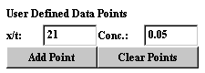
When Add Point is clicked, the specified point is saved and plotted.
A
maximum of 15 points can be plotted at one time.
The only way to get rid of points is to click Clear Points. Even
though the plot clears when Clear Curves is clicked, the points are still
saved and will be shown when Add Point is clicked or when another curve
is plotted.
Known Issue: Automatic Scaling
sometimes has difficulty displaying the correct horizontal subdivisions
when adding a point is the very first thing the user does. The correct
points are stored and the display usually fixes itself as soon as a curve
is plotted or after other interaction. This will be investigated
and fixed as time permits.
Plot Attributes
These controls affect the way the plots and data are shown.
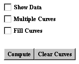
Checking the Show Data checkbox will display the data as a list of
points in a popup window. The popup window has the number of points
specified in "Number of points to compute"
and the parameters used to plot that curve. If there are multiple
curves present, a popup window is created for each curve. Each window
has a color coded border to match the data with the curve is represents.
Remember that Show Data is going to show ALL of the data. Don't press
it if there are 20 curves plotted with 10,000 points each unless you want
20 popups with 10,000 points in each one.
Multiple Curves allows more than one curve to be plotted at a time.
If this is not checked, pressing Compute will clear the previous curve.
If this is checked, up to 8 curves can be displayed in different colors.
Additional curves will be shown in black.
Fill Curves will fill the area under each curve with the curve's color.
Curves are filled in the order drawn, so usually this ends up obscuring
other curves. This is probably not the most useful option.
Compute takes the parameters currently entered and computes a new curve.
Clear Curves clears curve data but not point data.
Known Issue: The popup windows created by Show Data
cannot be closed by clicking the X icon on the title bar. They can
only be removed by unchecking Show Data.
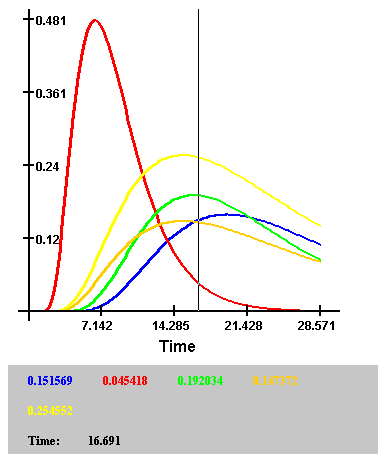
Plot Interaction
The user can see the numerical values of the different curves at different
time or distance points as shown.
After a curve is plotted, left click in the plot area and a vertical
line will appear. In the area below the plot, the time or distance
the line intersects will be shown along with the values of the curves at
this time or distance. The curves and values are matched by colors,
and a maximum of 8 curves can be interrogated this way. If additional
curves are plotted, they will appear in black and no data for them will
appear below the plot.
The bar can be slid left and right by holding the left mouse button
while moving the mouse.
Last Modified: October 17, 2000
Jeffrey J. Decker